Doc blocks for design system documentation

If you document design systems, I’m about to save you a ton of time. Because Storybook comes with lesser-known components for organizing colors, typography, and icons.
ColorPalette
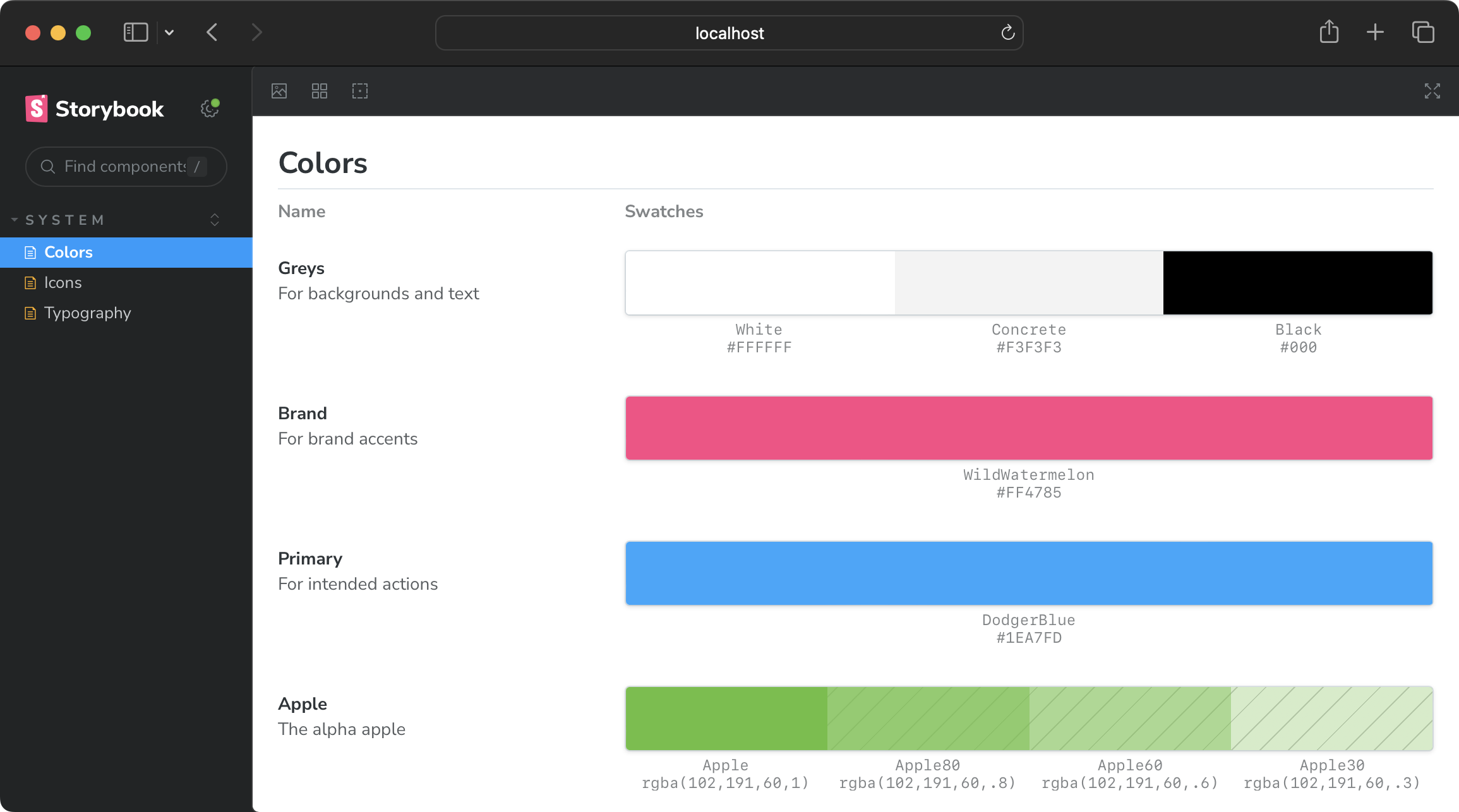
Display color systems with the ColorPalette component.

Import "@storybook/blocks".
Then render a ColorPalette with a single ColorItem inside.
import { ColorPalette, ColorItem } from "@storybook/blocks"
<ColorPalette>  <ColorItem /></ColorPalette>
Create an object with a key and color value.
And pass it to the ColorItem component via the color prop.
Both key and value are displayed in the UI.
<ColorItem colors={{ Apple: "#66bf3c" }} />Describe ColorItems with title and subtitle props.
<ColorItem title="Apple" subtitle="A delicious brand color." colors={{ Apple: "#66bf3c" }}/>Add as many colors to the colors prop as needed.
<ColorItem title="Apple" subtitle="A delicious brand color." colors={{ Apple: "#66bf3c", AppleDark: "#46991f", AppleLight: "#83da5a" }}/>Use any CSS-supported color value.
ColorItem adds gray cross-hatches to indicate translucency — where color functions with non-1 alpha values are used.
<ColorItem title="Apple" subtitle="A delicious brand color." colors={{ Apple: "rgba(102,191,60,1)", Apple60: "rgba(102,191,60,.6)", Apple30: "rgba(102,191,60,.3)", }}/>See full ColorPalette API reference.
Typeset
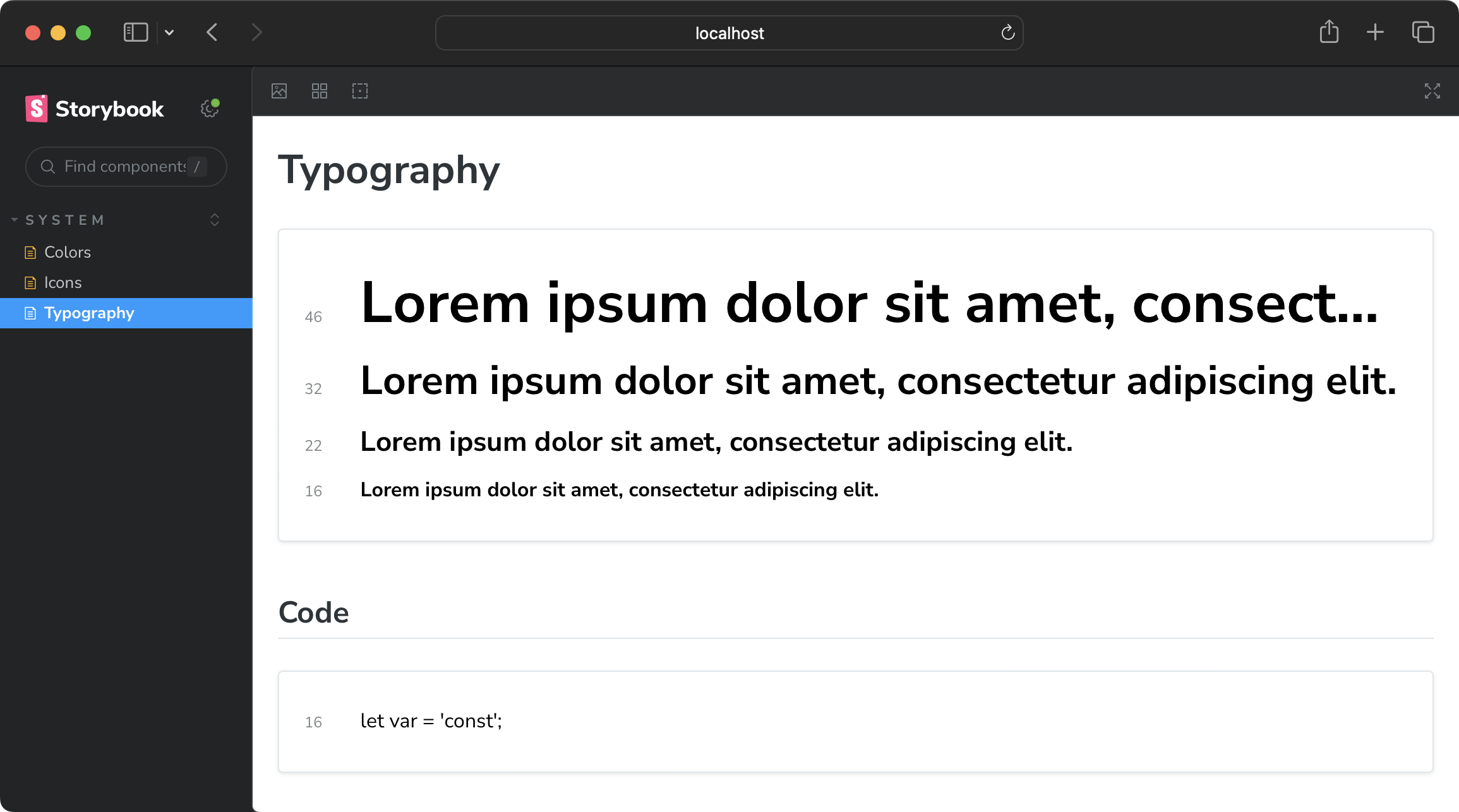
Display typography systems with the Typeset component.

Import the Typeset component from @storybook/blocks.
import { Typeset } from "@storybook/blocks";
<Typeset {/* required props */} />
Typeset requires four props to render: fontSizes, fontWeight, sampleText, and fontFamily.
fontSizes and fontWeight support any supported CSS value (and numbers).
<Typeset fontSizes={["2.875em", "2em", "1.375em", "1em"]} fontWeight="900" sampleText="Lorem ipsum dolor sit amet, consectetur adipiscing elit." fontFamily='"Nunito Sans", "Helvetica Neue", Helvetica, Arial, sans-serif'/>Create a new Typeset block for every discrete typographical subset.
## Code
<Typeset  fontSizes={[16]}  fontWeight={400}  sampleText="let var = 'const';"  fontFamily='ui-monospace,             Menlo, Monaco,             "Cascadia Mono", "Segoe UI Mono",             "Roboto Mono",             "Oxygen Mono",             "Ubuntu Monospace",             "Source Code Pro",             "Fira Mono",             "Droid Sans Mono",             "Courier New", monospace;'/>
See full Typeset API reference.
IconGallery
Display icons with the IconGallery component.
![]()
Import "@storybook/blocks".
Then render a IconGallery with a single IconItem inside it.
import { IconGallery, IconItem } from "@storybook/blocks"
<IconGallery>  <IconItem></IconItem></IconGallery>
Place an icon inside IconItem.
Then display that icon’s name with the name prop.
 import * as Icons from "@storybook/icons";
<IconGallery>  <IconItem name="Accessibility">    <Icons.Accessibility />  </IconItem></IconGallery>
Take this further — in React — by dynamically generating all available icons.
## Storybook icons
<IconGallery>  {Object.entries(Icons)    .filter(([name]) => name !== 'iconList')    .map(([name, Icon]) => (      <IconItem name={name}>        <Icon />      </IconItem>    ))}</IconGallery>
See full IconGallery API reference.
Learn more…
Find in-depth references for each component on the Storybook docs page and Chromatic YouTube channel.