How to Theme Storybook
Let’s make Storybook our own with a custom theme!
It’s super easy, you just need a 7:3 aspect ratio logo, text editor, and a strong preference for light or dark mode.
Let’s dive in.
Initial setup
This tutorial requires uncommon setup. So, let’s get that out of the way.
- In the
.stoyrybookdirectory, create a newmanagermodule.- Import
addonsfrom “@storybook/manager-api” - And
themesfrom “@storybook/theming”
- Import
import {addons} from '@storybook/manager-api'import {themes} from '@storybook/theming'Add a 350x150 image to the /public directory. (Storybook 7 serves this directory by default.) I have a 350x150 .png with a transparent backgroup.
Now we’re ready to set up a themes.
Set persistant light or dark color scheme
Create a new config object using addons.setConfig.
Provide an object with a theme property and use one of the preconfigured themes. themes.normal is the default and respond’s to the user’s preferred color scheme.
import {addons} from '@storybook/manager-api'import {themes} from '@storybook/theming'
addons.setConfig({  theme: themes.normal,})
However, you can set an explicit theme with options light or dark.
Ensuring that Storybook looks the same indifferent to user’s system theme.
import {addons} from '@storybook/manager-api'import {themes} from '@storybook/theming'
addons.setConfig({  theme: themes.normal,  theme: themes.light, // or themes.dark})
Restart to see change.
Setting up a custom theme with create
Now we’re using a light theme but our our configuration options are limited.
Refactor this config object to allow for a custom image and colors.
- Import the
createmethod from@storybook/theming. - Replace
theme.lightwithcreate({ base: "light"})
import {addons} from '@storybook/manager-api'import {theme} from '@storybook/theming'import {create} from '@storybook/theming'
addons.setConfig({  theme: theme.light,  theme: create({base: 'light'}),})
These are functionally identical. But creating a theme opens more options. And the base option to override and extend theme values without having to specify every value.
Restart to see changes.
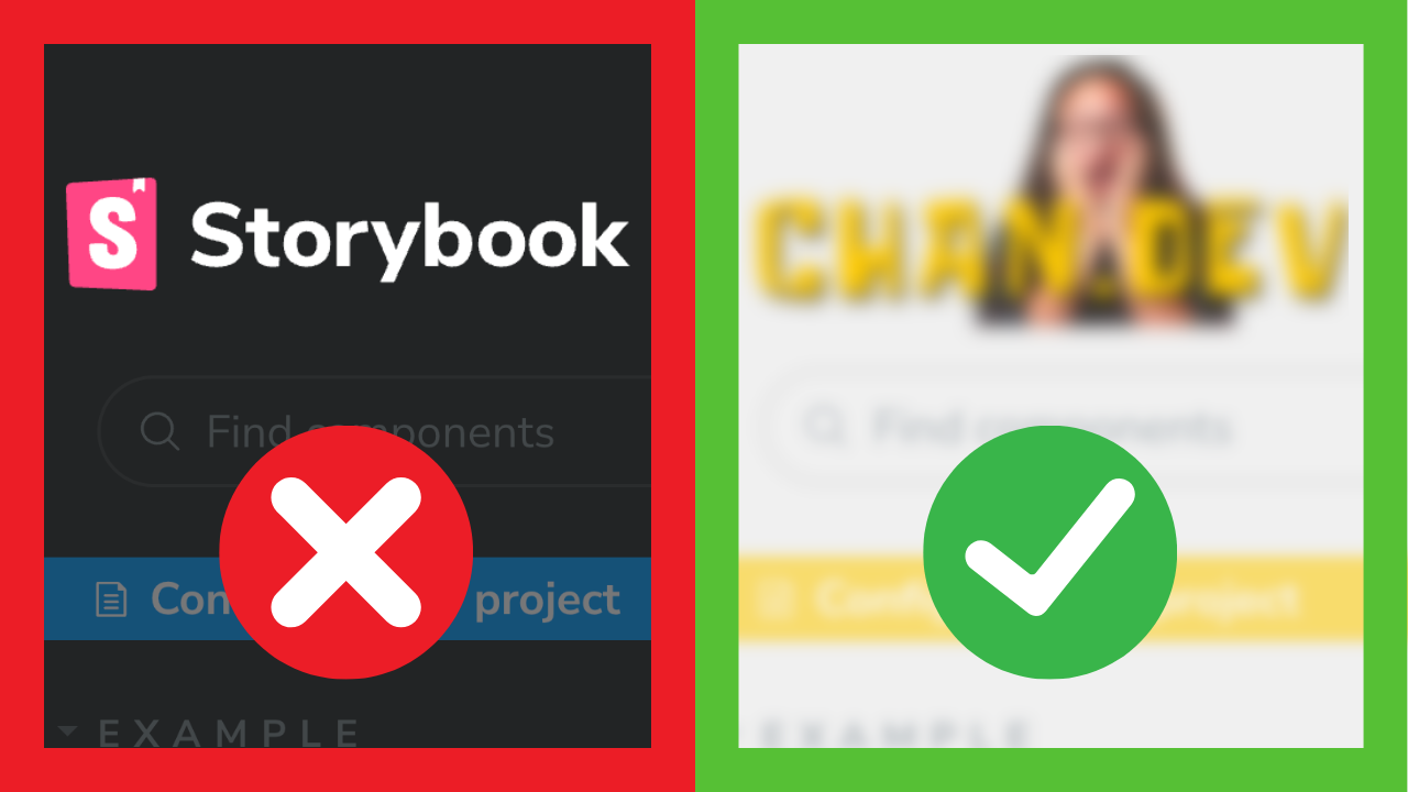
Add brand image to Storybook
We all know that the most important part of any project is the logo! Let’s add ours using our custom theme
Add brandTitle, brandUrl, brandImage, and optional brandTarget properties to the theme object.
addons.setConfig({  theme: create({    base: "light"
    brandTitle: "My custom Storybook",    brandUrl: "https://chan.dev",    brandImage: "/chan-dev.png", // using publicly served /public directory    brandTarget: '_self',  }),});
Restart to see changes.
Set brand colors and typography
With our theme in place, Storybook accepts a number of options for general theming. Let’s explore a few:
For a full list of theming values and options, check out the post listed in the description below.
addons.setConfig({  theme: create({    base: "light"    /* FOLD: …brand image… :FOLD */
    colorSecondary: "#ffcc00",    appBg: "#f0f0f0",    appBorderColor: "#ccc",    appBorderRadius: 0,    textColor: "#333",    barTextColor: "#666",    barSelectedColor: "pink",  }),});
Restart to see changes.
Outro
Now you know how to theme Storybook! We leaned how to make Storybook your own with a custom brand image, base theme, and colors.
If you have specific areas of Storybook that you’d like to theme that aren’t covered, checkout Storybook’s theming doc. It includes an exhaustive list of themeable values and some riskier styling options 😄.
That’s it for today. Check out one of these videos to learn more about Storybook. I’m @chantastic. I’ll see you in the next one. Bye.
Prefer video?
Watch on YouTube!